
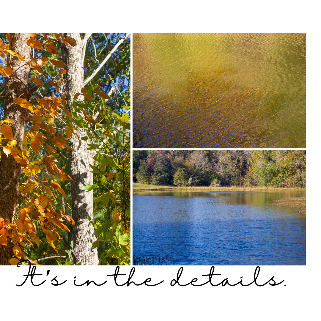
This week, I did get bogged down in details. I started Kim Klassen’s My Week in Photos, a month-long photography class. The goal is to document the week. Each week, Kim provides a prompt, which is only a suggestion and an option to get us thinking. This week, the theme has been “in the details.”
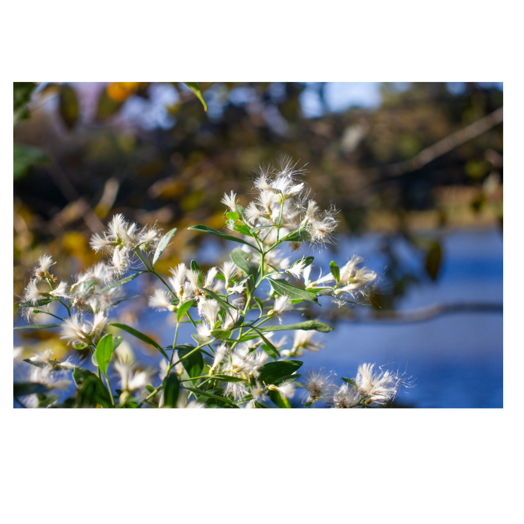
Kim’s style is so different. She’s into soft post-processing–lots of muted and soft colors, a bit of haziness, lots of warmth. I’ve never really tried to define my style. Shoot, I’m not even sure I have a style! I’m not into still-life photography, as Kim is; I tend to make images outdoors, and even before this week, I often make images of the details–a kind of macro photography without the macro equipment–close-ups of the things I see, the textures, shapes, and colors that intrigue me.
To give credit where credit is due, I used some Lightroom print layouts by Kim Klassen to create the carousel elements. I imported the LR layout into Canva to add the text. Then I uploaded the images to Instagram. Not an easy task! I still have a lot to learn about creating and sharing my photography on social media.
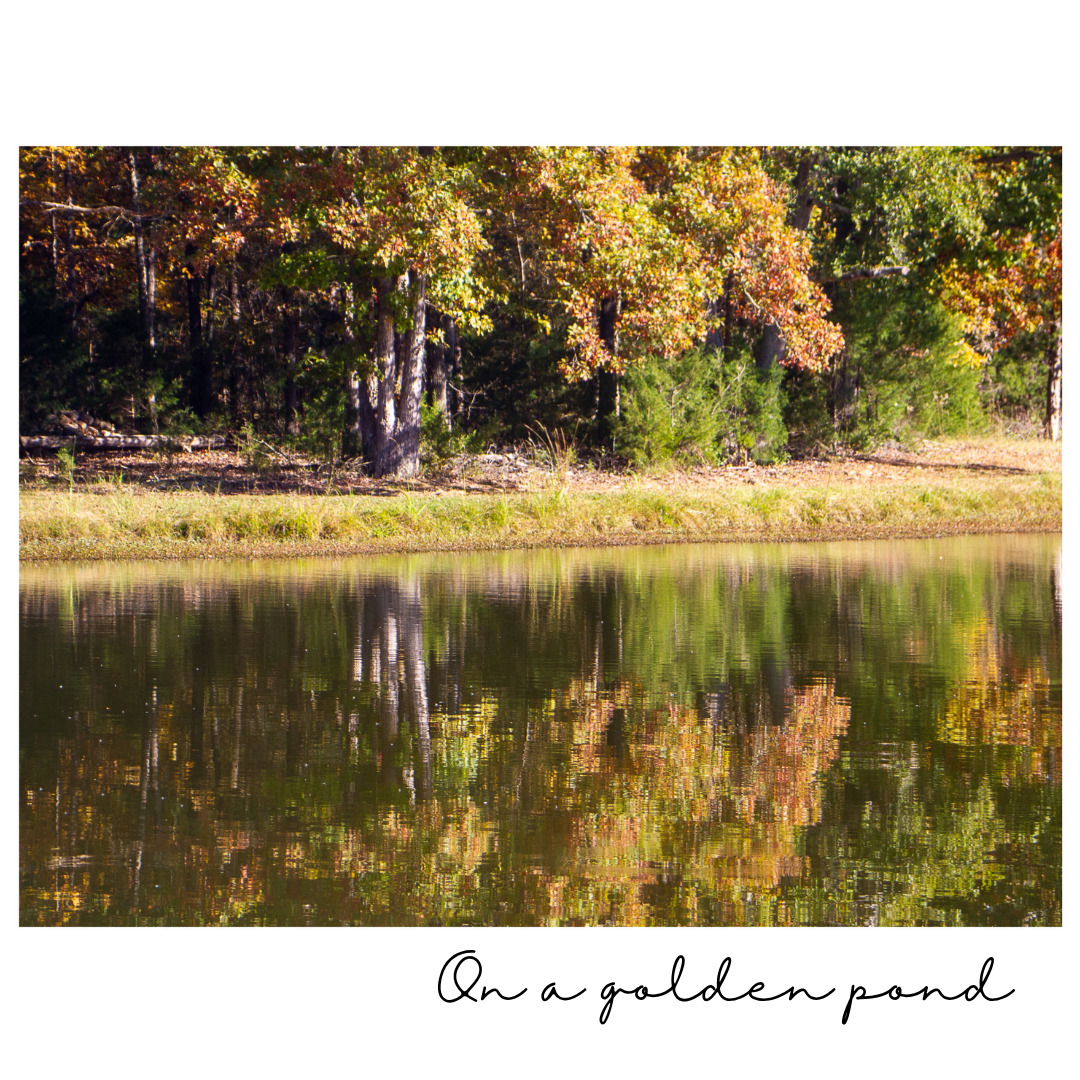
I did choose to play with one image.

To create this effect, I used a Kim Klassen preset she shared for the class. I like both treatments of the image. The top one is the original with basic Lightroom adjustments; the bottom uses the tone preset and the Tuesday preset. The two images present two very different tones, don’t they?
So, it really does come down to details. And one of the details has to do with the story I want to tell.
Now, I’m off to play with some more images!
