Summer Vacation 2018

It has been a while since I had a teacher’s version of “summer vacation,” that extended period between June and August when I am not in school. For the previous five years, I taught at Remington College in Columbia. We worked in four-week modules, and since I was part time, I worked a mod and then had the next mod off. Now that I am working full-time in secondary education again at Newberry Academy, I now teach for thirty-six weeks and now I’m off for about 10—all of June and July and two weeks in August. Oh, perhaps I should say I also have most of this last week of May off as well, even though I’m going back to school tomorrow for a yearbook mini-camp.

So, how will I spend my summer?

First, I’m going to catch up on my fun reading! I don’t have a reading list yet per se, but I have several books on my Kindle that I want to read.

Second, I’m going to work on my photography. I have subscribed off and on to Lenswork Magazine, a print and online magazine that focuses on the photograph itself, not the gear or even the techniques. For the last couple of years, the publishers have had a juried “contest” in which photographers submit a story in six photographs. I don’t think I can enter that contest this year, but I think it might give me a focus for my summer work. Can I make images that capture the story in six images in such a way that each image can also stand alone and tell that story? In preparation, I’m charging up the batteries now, and soon I’ll clear the memory card!

I’m also planning to work on editing techniques. I joined the Shift Art website (pricey!), but I think it will be worth it. There are tutorials and articles and other goodies to inspire me.

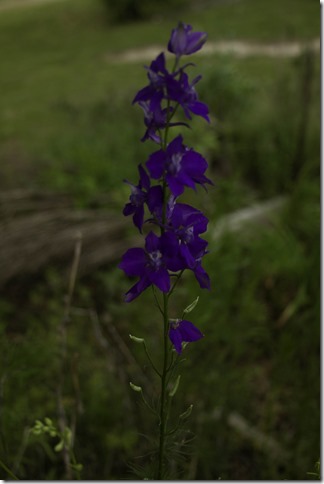
This morning, I worked on learning some editing techniques using Auto Tone and Auto Color in Photoshop. I used an image I took a couple of weeks ago. I don’t know the name of this flower, but it’s pretty, and it’s interesting. I wanted to make sure the flower was dominant, so I practiced, and edited, and started over. This is the image I came up with. I used Auto Tone and Auto Color. Then I applied two layers of patterns and textures. Finally, I added a light vignette. I’ll put the original and edited image side by side to show the two versions.


The first image is the original, unedited image. It’s too dark. My edit, the second one, lightens the image and brings out the flower. I like the kind of hazy background, which is further emphasized a bit by the pattern and the texture. At the end of the process, I added a vignette using a curves adjustment layer, dragging the curve down toward the bottom right corner, and then using a black brush to uncover the portions of the image I wanted to reveal. I lowered the opacity of this vignette layer as well because I did not want it too dark on the edges. I still wanted the brightness and haziness of the background to come through.

originalIMG_4833

(I think I may have desaturated the background slightly as well so that the color of the flower can stand out.)

I enjoy floral photography, and I enjoy applying textures. I want to stretch myself as a photographic artist.
Monochrome Edits—Black (and whtie) Friday on Saturday

As you know, if you read my Thursday entry, it’s been quite the week around the Fulmer household. We are thankful that our son continues to improve! I spent yesterday in “recuperation” mode and missed my Black(and white) Friday.

Today (it’s Saturday) I wanted to create a vintage look by applying a sepia finish. I know, there are numerous Photoshop actions that can accomplish the same effect, but I wanted to learn a process myself. And, as one writer pointed out as I looked at tutorials and directions, there are about 9000 ways to do the same thing in Photoshop, so you may find a technique that works better for you.

untitled-45

Here is my original. I had gathered some acorns and put them my pocket one morning in honor of my father, who frequently put things in his pockets when he was outside. There were all kinds of things on our hearth where he emptied his pockets! To me, this image wanted a vintage effect.

After making adjustments in Lightroom, I sent the image to Photoshop CC. The first thing I try to do is duplicate the background layer by using the shortcut Ctl-J on my PC.

Next, I created a Channel Mixer adjustment layer and checked the Monochrome box. Doing that converted the layer to black and white/grayscale.

Then, I opened a Photo Filter layer, and chose the Sepia present. I adjusted the density to about 90%. I wasn’t quite satisfied because I wanted a little of the color of the acorns to show. So, I went back to the Channel Mixer layer, adjusted the brush opacity to 30% and brushed out the effect to reveal some of the greens and browns of the acorns only.  This is the final result.

monochrome-acorns

It’s mostly monochrome with a vintage look.

NOTE: I tried another method, using the tutorial here. There are multiple steps, and the result is a color version. To this, I added a black and white adjustment layer and a photo filter for sepia, with the density set at 80. Here is the result.

monochrome-acorns-2

Insight into Editing Process

I’m still working with a batch of images I made over the weekend. (Actually, I’m procrastinating. I have two sets of essays I need to grade, and I’m putting it off!)

I love two kinds of images: images with deep, rich color, slightly “underexposed” to make the colors deeper and richer, and I like images with softer, more romantic moods, more “transparent” colors and treatments. I have not worked with that latter treatment very much, but I am learning to create the images with the richer colors. At first, I simply changed the exposure in Lightroom or Photoshop to underexpose by 1/3. It worked. It was simple. But I knew I could do more.

Here’s my experiment today. I started with this image. (If you know the name of this flower, please tell me. Mr. Chappells at the nursery told me, but by the time I got home, I had forgotten. I know it is a C, an O, and PH, and maybe an E. Vanna White, are you there?)

Here is my original, as shot.

Original without edits

It has been converted to JPEG by Lightroom for use on the web, but this is the RAW image. Most RAW images need some enhancements to bring out the best. The advantage of using RAW images, though, is that the camera records more detail, so there’s more data to work with later in Lightroom.

Before sending the image to Photoshop, I’ll make a few adjustments: setting the black points and the white points, adjusting highlights and shadows, adjusting clarity and perhaps vibrance and/or saturation. A while back, I read a book by David du Chemin about editing in Lightroom, and he recommended using a medium contract curve on images and readjusting as necessary. Edited original

It already looks better, and I could be satisfied with this. But I’m going to do more in Photoshop. If you use Lightroom for basic edits, there is a quick way to send an image into Photoshop: Ctrl-E sends it straight into Photoshop.

I have been learning about luminosity masks. There is a lot I don’t know, but I’m beginning to learn more.

Once in Photoshop, I create a duplicate layer from the background with the short Ctrl-J. (oh, if you use a Mac, substitute Command for Ctrl.)

Open the Channels adjustment panel, and look at the four channels: RBG, Red, Blue, Green. The latter three will be monotone. Choose the channel with the greatest contrast between the highlights and the darks.

image

I thought the Green channel had the greatest degree of contrast. Select the highlights by holding the Ctrl key while left-clicking on the Green channel thumbnail. The “marching ants” will outline the highlights.

Then create a Curves adjustment layer. Adjust the curves to make the highlights a little darker by dragging the square on the right side of the curve down. You can also adjust the other areas of the curve as well until you’re satisfied with the look of the image.

image

Compare the two images: the original with the final. What do you think?

Original without edits

flower highlight edit

His Eye Is on the Sparrow. . . .

finch

I was the pianist for the early service this morning at church. I searched and searched for a prelude  to use this morning, and nothing worked for me yesterday. I simply had no idea what I was going to play until this morning as I was assembling my notebook before going to church. I saw a couple of things that looked “interesting”: “To God Be the Glory,” “His Eye Is on the Sparrow,” to name them. I decided to use the latter as the prelude and the former as the postlude.

And that’s a long-winded way to explain my photo. I came home from church and fixed my bagel for breakfast. As I sat down to eat, I looked out the window at the bird feeders, and this house finch was having his breakfast, too! I grabbed the camera found the CF card, and snapped just a couple. Then, I played.

I had ordered Susan Tuttle’s book, Digital Expressions, which is a a collection of tutorials for creating digital art in Photoshop Elements. Last night I began working through a couple of the first ones, the easier ones. Lesson one, as I call it, is how to create a vignette, while the second lesson is about creating a pop of color. Well, my finch is not exactly brilliantly colored, but I did want to isolate him and let him be the focal point in the image. I could have cropped the image closer, but I wanted the context of the feeder. So I combined the two lessons.

First, I used the marquee tool to trace around the bird. After selecting it, I used Shift-Control-I to “inverse” it. I created a Hue-Saturation layer, and desaturated the image. I did have to clean up the image a bit with the clone tool. Then I increased the contrast a bit (36% or so). I merged the layers before creating the vignette.

To create the vignette, I used the elliptical marquee tool to mark the feeder and the bird, “inversed” the selections, and added a new fill layer. I used black as the color to fill. I set the feather setting between 40 and 60 (I forgot the actual setting). I lowered the opacity of the vignette to about 80% so that it would blend a little bit better.

I like the results. The finch is the focal point; desaturating the background puts the emphasis on the bird, which is still in color, and the vignette draws the eye to the bird as well. I think this is a good way to hide a busy background.

Time and Writing and Art

It’s been nearly a month since my last entry here. I have these “spells” when writing calls to me and I ignore the call. I’ve been doing that lately—ignoring the class. Oh, I’ve been writing—in my morning pages journal, in my art journal/documented life unplanner/right-brain planner, fauxbonichi journal—Oh, yes, I am writing. Just not here in this space. Just not for publication.

I have been reading a lot. I’m several chapters into Elizabeth Gilbert’s book, Big Magic. I have to thank my friend Mary for loaning me her book. Unfortunately, because she loaned it to me, I can’t mark it up! So, I bought my own Kindle edition so that I could highlight, underline, and comment. Oh, yes, I am writing quotes in my journals/planners/sticky notes, too.

And I’m reading one of Rick Sammons’ photography books on seeing creatively. I am reminded throughout the book that photography is more than settings on the camera and pressing a shutter button. It is about seeing the world, not merely glancing around, but looking deeply, and seeing what is not always obvious. I liked his analogy of using a shot-gun approach to photography versus a more considered approach. Sometimes, when we go out to photograph things, we take pictures of EVERYTHING in sight—aim and shoot! However, Sammons reminds me that while it’s okay to take the postcard pictures and attempt to capture everything, we also need to take the time to look closely, to see what “we” see and not what we’re necessarily expected to see.

The other aspect of Sammons’ book that I appreciate is that photography, especially digital photography, is not just about getting it right in the camera, but also about seeing our creative vision through in the post-processing stage. In most of the chapters, Sammons writes about some of the creative tools he uses—Lightroom, Photoshop, Topaz plug-ins, Nik software. .  . .

Last night, I played with some of those tools on images I took last weekend. And I played with layering textures and photo veils and other tools in my tool kit. I came up with this image of the dogwood. I think I like it. I like it very much.

topaz-adjustments-on-dogwood

untitled-13

This is the original (SOOC), and I like it, too.

I am trying to salvage this image of the heron that Mama and I saw while we were at Bennetts Point three weeks ago. It landed in the pasture next to our place there. I was not dressed to go outside to get a closer shot, and I had to shoot fast! I think those birds know when I’m coming with a camera and they are camera shy.

This is the original. Trust me, it’s a heron!

untitled-2

I cropped it, “fuzzed up” the grass a bit with a Topaz plug-in, and added several layers of textures, brushing each layer off the heron. This is the result.

heron at bennetts point

It does have a painterly look, and I like that. I like the softness of the background, but it’s still missing something, and I will come back to it again to see what I need to do.

Vision, creativity, writing, reading—it’s all part of what I want to do.

A Tuesday Technique and a Texture Tuesday

IMG_5774-2

I wrote about my cherry blossoms on Saturday. Today, I’m using one of the images to made Saturday. I played with my Lensbaby Composer Pro and Sweet 35 optic and a set of extension tubes to try for some macro photography. Let me tell you, it is sometimes much harder than it seems. There was a light breeze that kept shaking the tree branches. I knew that shooting wide open (2.8 on the Sweet 35) would allow me to use a fast shutter speed, which would minimize the shake. But I had to put the camera in the branches, and I kept bumping them. I finally resorted to hauling out the tripod. Even then I still had some problems getting close enough to the blossoms to make the image I wanted. I had hoped to get some images with the water drops from the rain that morning.

So, I chose the image above to work with. The first thing I did was make a few adjustments in Lightroom—white balance, tone, exposure, contrast, clarity. I have to admit that I make adjustments “to taste” as opposed to formula or correctness. If it looks like I want it to, I call it “correct.”  I also cropped the image to focus on the larger bloom. After my basic adjustments, I opened the image in Photoshop. (I may be one of the few photographers who still use CS6 rather CC.)

One of my favorite actions is the Levels Boost Action from the girls at Love That Shot. I’ve used this action for years. I think it boosts the contrast just a bit more and brightens the image. Then I had fun applying textures. I like textures with some kind of script on them. I think these old-fashioned papers can give the image a vintage look.

texture-IMG_5774

I used a vintage postcard paper from a collection of textures and overlays. I use a free action from MCP Actions to place textures (texture applicator). I used that MCP texture application action, set the blending mode to soft light with an opacity of 60%. I did not like the script over the flowers, but I wanted to retain the color of the texture. I took a Clickin’ Moms’ class last summer, and I learned a trick that helps me retain color but lose texture. Here’s the trick:

1. Make sure you are working on the image itself and not the layer mask. This is important.

2. Use the lasso tool and outline the area where you want to remove the color.

3. Select Filter>Blur>Gaussian Blur. Pull the slider to a high number—10 or higher. On this image, I think I pulled the slider to the right to 25. This removed any traces of the script but left the color.

Then I added Kim Klassen’s Magic Texture (KK2). I reduced the opacity to 30% and set the blend mode to soft light. I brushed a little of the magic texture off the lighter portions of the image. 

By the way, the water drops are evident in the cropped version.